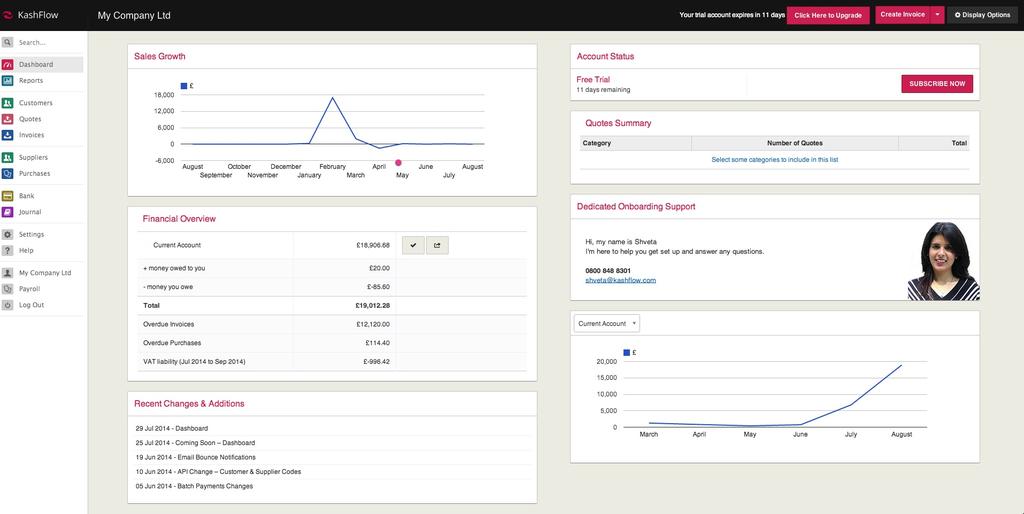
Graph change on the new KashFlow dashboard
There has been a lot of discussion among our customers (and among the KashFlow team) since we launched the brand new dashboard earlier this week.
Great news is that almost everyone agrees that the new, decluttered, customisable dashboard is a big step forward from the old, static Overview page. Hooray!
However, there were pockets of concern about the graphs we originally included in the dashboard, specifically the smoothed lines which some indicated were misleading, suggesting interpolation between discrete data points. Put another way, they didn’t dig the curves.
So we’ve gone back on the straight and narrow – per the below:
Many thanks to our customers for their feedback!
We will always aim to take what you say on board so if you want to leave any more comments about the dashboard, you can do so here.

