Another improvement to our accounting software based on feedback from our customers:
We released the first part of a wave of updates to our user interface on Thursday night.
The feedback has been overwhelming. Whilst the majority has been positive, there have been two things that a lot of people weren’t happy about
- The “alphabar” on the Customers and Suppliers pages was removed from the top of the page and only showed at the bottom
- The horizontal height of a row of data increased somewhat. It looks a lot nicer but you have to scroll more in long lists
Initially we stuck to our guns and said “give it time, you’ll love it eventually”. But as Friday turned into Saturday and more people logged in and commented we realised quite simply that we were wrong.
So we’ve made a few changes
Firstly that much-loved row of letters is now back at the top of the Customers and Suppliers page (remember, it only shows when sorting by Name).
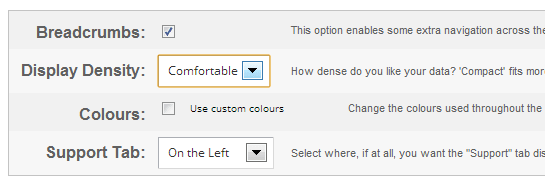
Secondly, we’ve given you control over how compact rows of data are. Go to Settings -> Display Options and change the setting for Display Density.
The ‘Comfortable’ option is the default, but if you want to pack a lot of rows of data into one screen then choose ‘Compact’. The ‘Cosy’ option is somewhere between the two.

Do keep giving us feedback, especially when we need telling we got something wrong.
