Putting the Billions and Trillions into perspective
There’s been so much media talk over the last couple of years about millions and billions of dollars. They all become just words and it’s hard to visualise how 100 billion looks next to 1 million.
Well, despair no more.
This great “info graphic” puts everything into perspective for you.
Click the image to get a bigger version. Excuse the political commentary, it’s not mine!
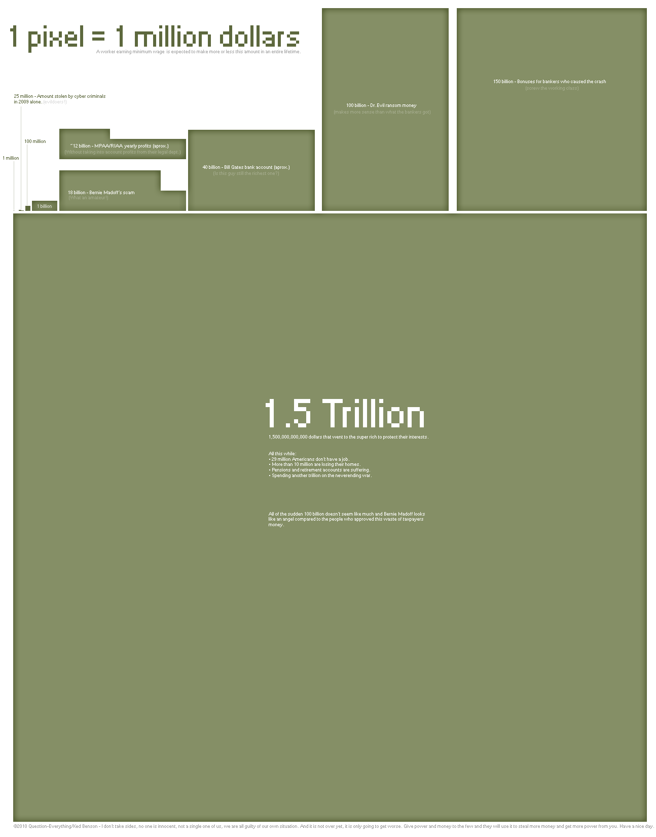
Image courtesy of Question Everything / Ked Benson